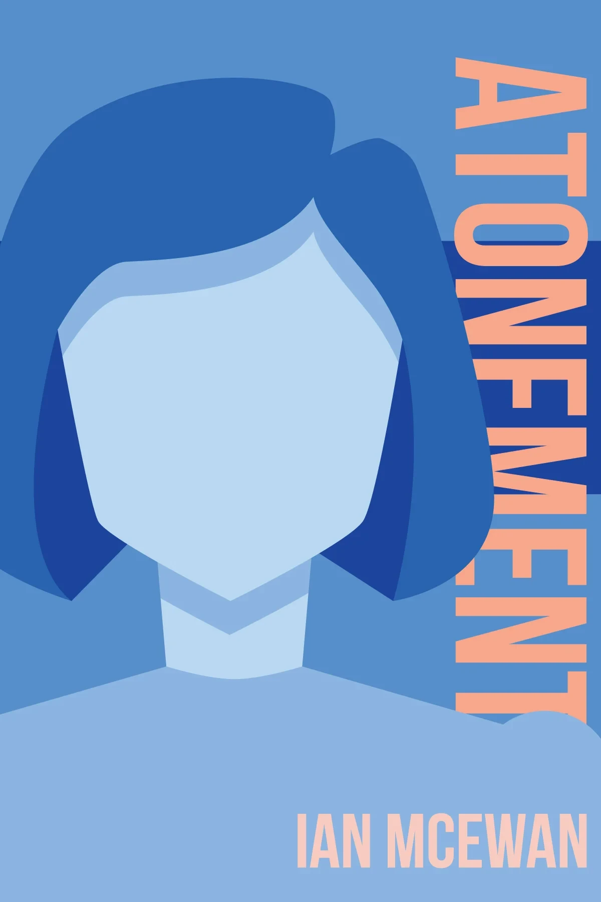
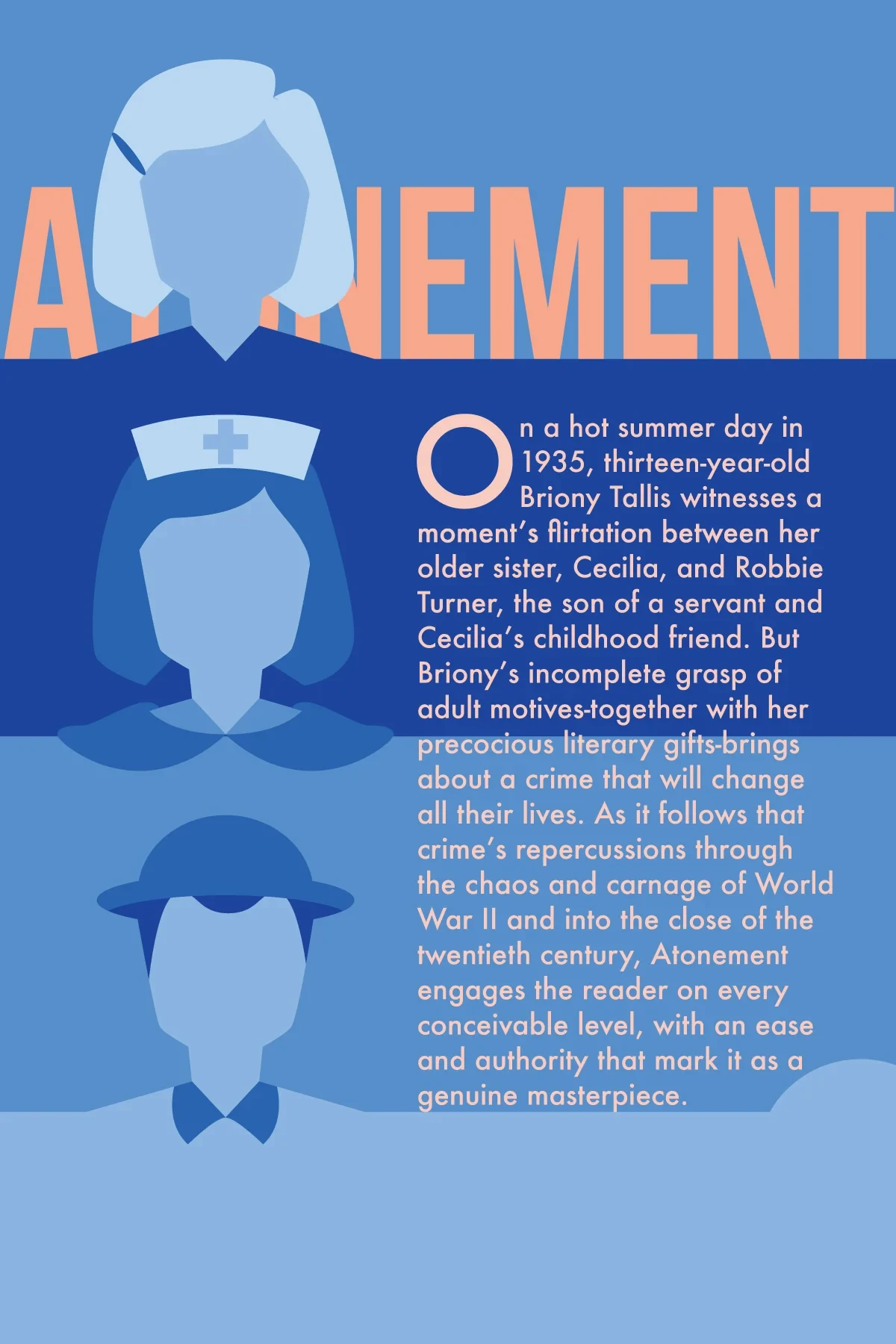
The front cover.
Overview
For my class in undergrad, we were asked to design a book cover and then iterate on it. I chose one of my favorite novels, Ian McEwan’s Atonement.
The novel spans four distinct timelines, and the final cover is built around these. It’s an illustrated, flat-color design in a single blue family, with a bold peach contrast for the text. The front is dominated by the large figure of the young Briony, on whom the opening of the novel focuses. The back stacks the other three in chronological order from bottom to top: Robbie, young adult Briony, and elderly Briony. All four timelines appear across the full wrap.
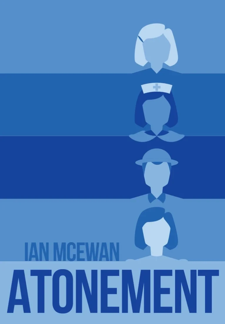
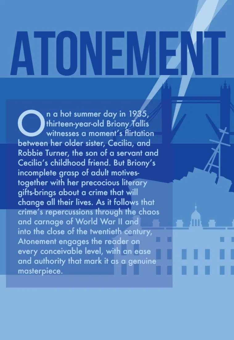
Version 1, front cover.
Reflection
My initial concept was very static, pairing each timeline on the front with a basic image on the back: young Briony and an estate, Robbie and a sinking ship at Dunkirk, young adult Briony and the London Bridge, and then elderly Briony simply paired with the title. After being pushed by my professor, I simplified and ultimately made the design stronger. Pushing the cover further from a very literal and static illustration, towards a simple system that the whole wrap could share, was a valuable lesson that I took from this project.